Blinds and Tint Co
A rebrand and website built around choosing the right window solution and arranging an in-home consultation.
- Professional Website
- Next.js
- Landing Page Build
- Cookie Consent
- CRM
- Quote Requests
- Booking Flow
- Local SEO
- Identity Refresh
- Photography Direction
- Type System
The website in motion
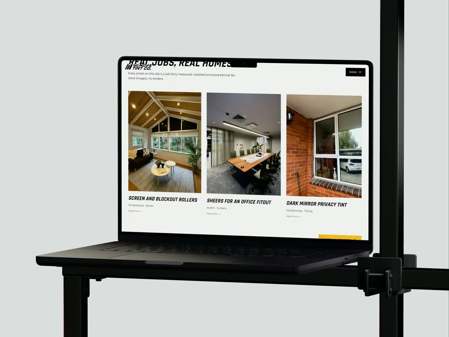
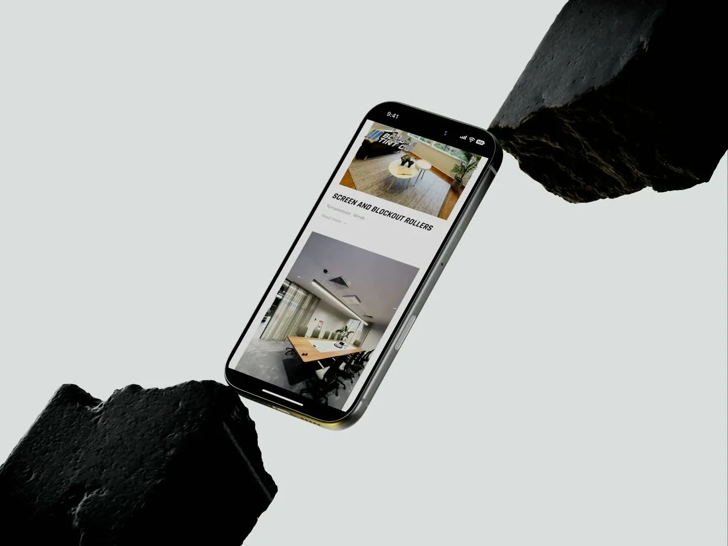
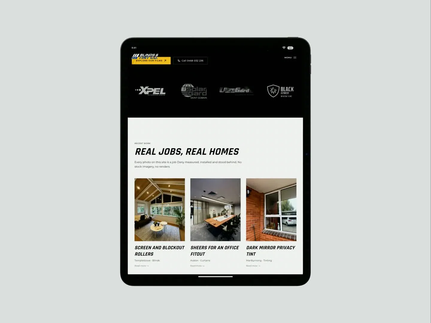
The project
Blinds and Tint Co install window tinting, blinds, curtains and shutters across Melbourne. The website needed to present that range clearly while helping customers understand the next step towards advice and a quote.
The project evolved through a refreshed black and yellow identity, applied to the main website and a separate landing-page build. Product information and finished-work imagery share the same visual rules, so the business remains recognisable throughout the journey.
The structure gives different services room to be explained while keeping the consultation and enquiry path easy to find. It supports a considered choice where the right option depends on the property, vehicle or space.
Move from a product name to the right window solution.
The rebrand brings blinds, curtains, shutters and tinting into one recognisable business. The website then has a practical job: helping someone narrow the options and provide enough context for advice.
- Step 01
Carry the identity into every entry point
The main website gives product searches a dedicated home. The same black and yellow identity carries through product information, finished-work imagery and the enquiry form, so a customer can explore different options without losing their sense of the business.
- Step 02
Distinguish the setting before the product
A person choosing coverings for a room needs to weigh light, privacy and appearance. Someone looking for tinting has a different starting point. Separate product and service content lets the website explain those choices without forcing every visitor through the same sales story.
- Step 03
Make the home quote more useful
The home quote form goes beyond a name and number. It asks about service type, window count, rooms, existing coverings, suburb and timeframe. These details help turn a broad product enquiry into a conversation about the actual property.
- Step 04
Use consultation questions to improve the explanations
The next review should compare the product requested with what the customer ultimately needs. If people regularly enquire about one covering but need another, the website can explain that choice earlier with clearer comparisons and relevant installations.
A closer look at the pages
Selected pages showing how the experience comes together.
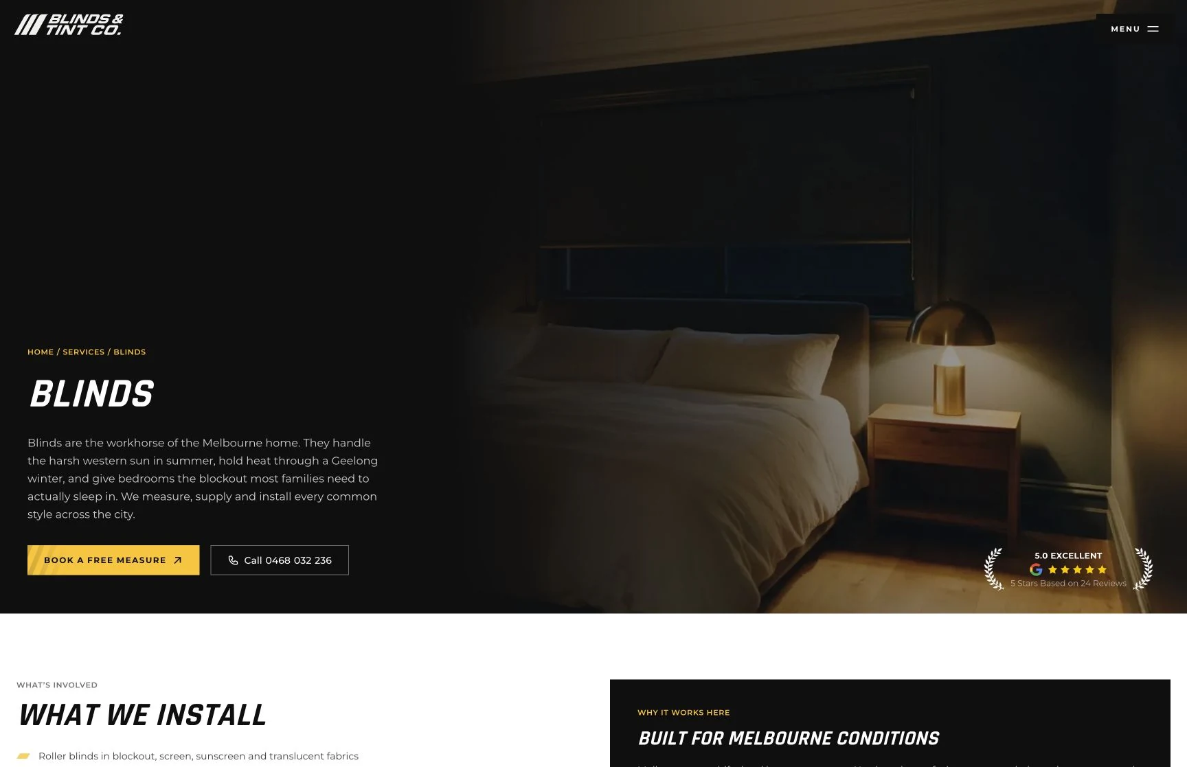
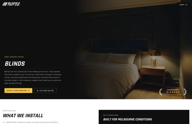
Blinds
Product information and the next step towards advice.
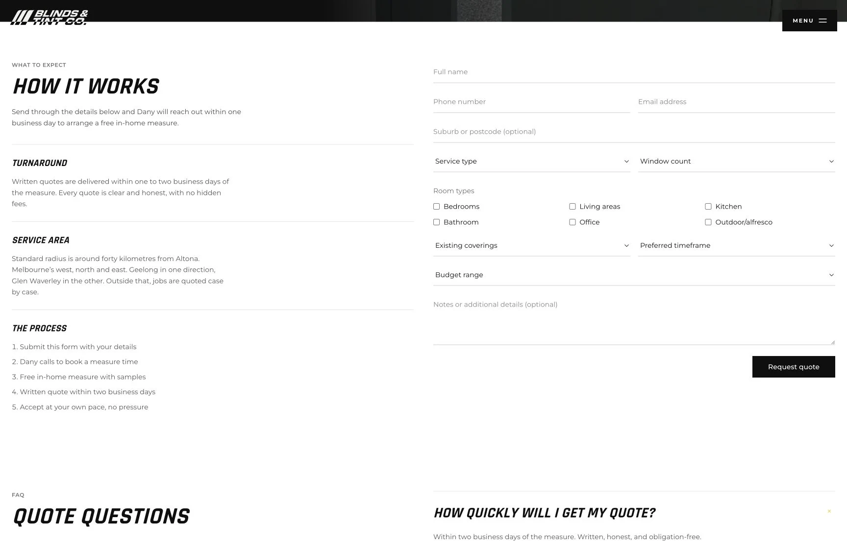
Window covering quote
A brief built around the windows, rooms and timing.
Under the hood
Shared design rules keep the identity consistent across the website and the earlier landing-page build. The rebuild included checks of the enquiry path, tracking and consent controls alongside the responsive layouts.
Phil has been amazing to work with, he's a friendly guy but most importantly — it didn't take much time for him to understand the scope of what I needed for my business, and fully execute that with minimal involvement from my end. He's very knowledgable in his field.
 Dany IbrahimBlinds & Tint Co
The rebrand carries through the whole journey, from first impression to a more informed enquiry. Future updates can build on that shared foundation.